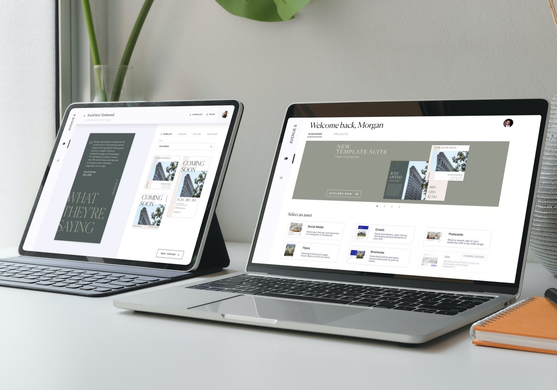
On the left, the editor interface displays a handful of social template options. On the right, a banner within the Brand Studio marketing platform announces the new template suites.
Templated Collateral SUITES
—CASE STUDY
Basic designs and a buggy user experience were contributing to low app engagement. We needed to get folks excited again, and with a sophisticated new platform on the way, we saw an opportunity to elevate both our template offering and the editor platform.
Art Direction, Branding, Visual Design Systems, Research, Social Media, Print Collateral, Email Marketing
Challenge
The template offering had become stale and repetitive. New options should spark creativity and be visually distinct from the core offering, while remaining faithful to the overall brand.
Exsting templates were either too turn-key or too advanced; we needed to strike a balance that was accessible for new folks, while encouraging power users to personalize every detail.
Previous app launches had been buggy and frustrating. We needed to gain users’ trust with a seamless experience.
“…EVERYTHING LOOKS THE SAME when I log on. I’M TRYING TO STAND OUT FROM THE CROWD, NOT BLEND IN.”
— Representative user feedback
Previous designs

Solution
A fresh new template suite! Inspired by editorial design and powerful type moments, the new designs featured more visual complexity, a greater range of asset types, and a bug-free experience thanks to extra QA. We also offered a workshop series to help users understand the editor and keep them coming back.
Approach
Research + Exploration
Review user feedback and identify common patterns in custom artwork requests.
Research the competition, source inspiration, and group into rough buckets.
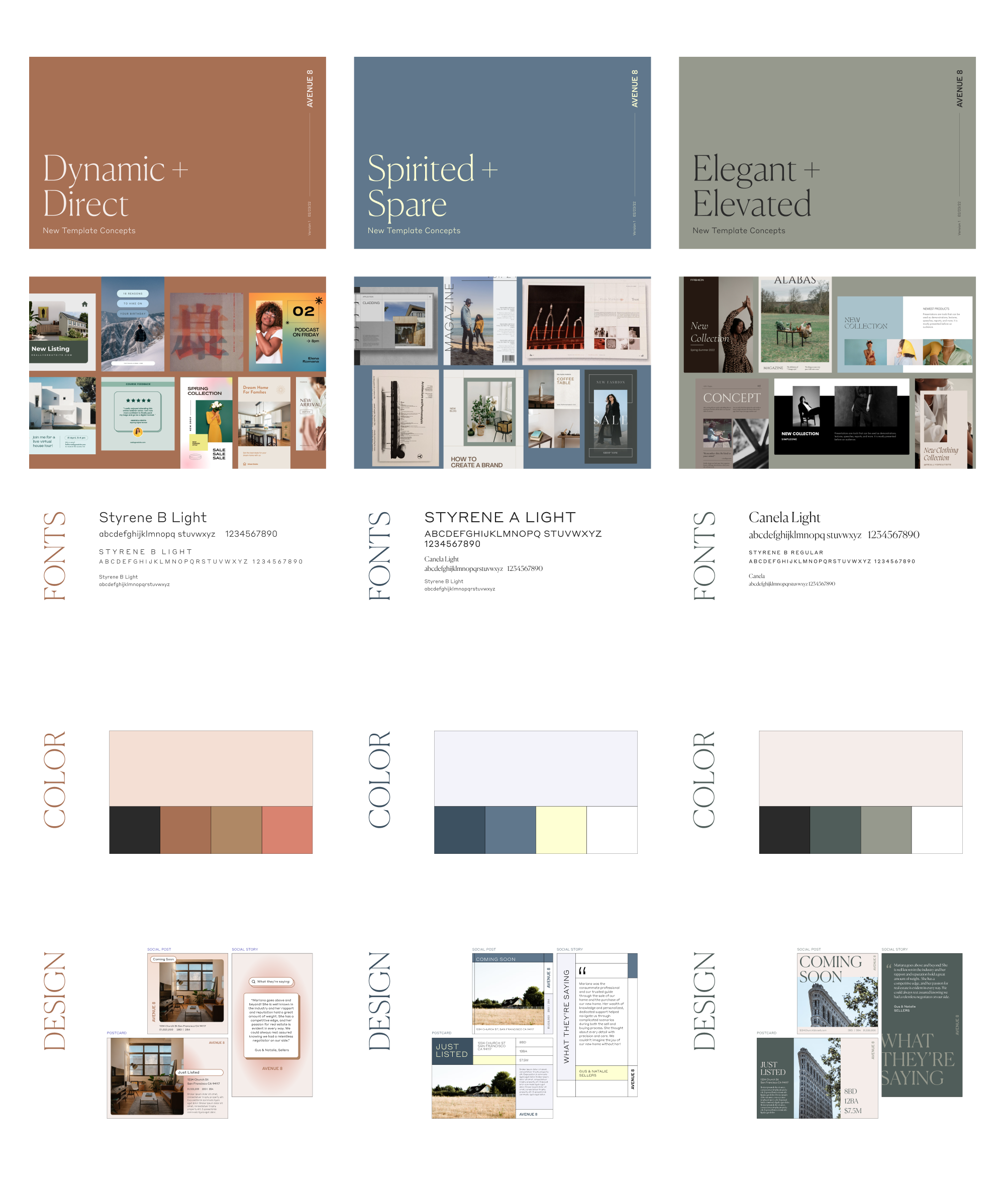
Explore color and font pairings within the existing brand guidelines. Instead of offering all our fonts, we picked two and used formatting to set the suites apart. This gave users a simple system with lots of variety and reserved our juicy display fonts for larger brand campaigns. Best of all? Engineering only had to add two new files.
DESIGN
We narrowed down to three directions: Dynamic + Direct, Spirited + Spare, and Elegant + Elevated.
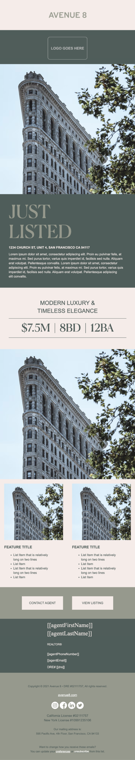
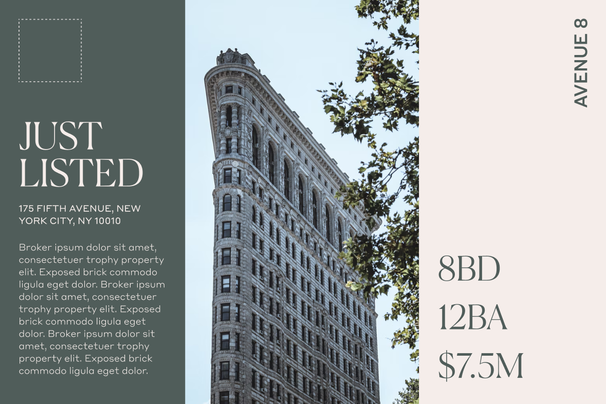
Each potential suite included a listing-focused postcard and social post, plus a social story focused on testimonials. These were our most popular existing formats, but the variety also helped us build effective templates across several dimensions and use cases.
FEEDBACK
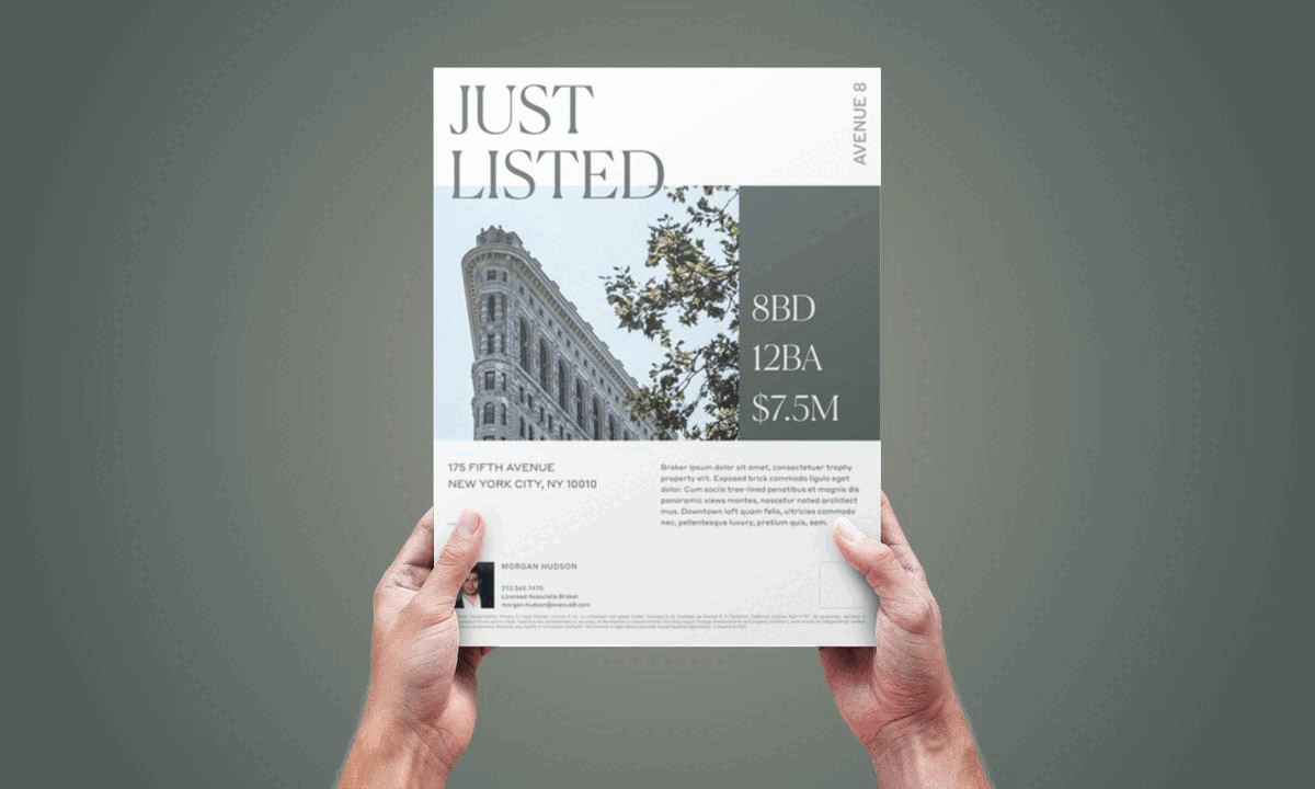
After a couple rounds of review, Elegant + Elevated emerged as the winner. We expanded the designs to include a multi-photo postcard, a double-sided flyer, two social post and story templates, and both single and multi-property emails.
Once templates migrated into Brand Studio, Design worked with Product to bug-test everything from thumbnail previews to mapped fields to auto-populated content.
We chose Flatiron content for mockups to welcome our recently launched NYC office. They were tired of logging in and only seeing California represented!
Learnings
The user comes first — trust them! We originally locked layout edit options to preserve the brand, then realized that defeated the entire goal of increasing accessibility. We wanted to prioritize our users’ creative freedom over a pixel-perfect, standardized output.
Sometimes, kill your darlings. A week before launch, leadership switched the campaign back to our core brand colors so everything would be consistent in the app. It was disappointing to move away from refreshed direction, but in the end it was the right choice for our users.
CREDITS
In-house at Avenue 8, a digital and mobile-first residential real estate brokerage.
Brand Director Taylor Bennet
Senior Designer Sarah Menard
Jr Designer Anthony Aguilera
Built in Figma + Design Huddle